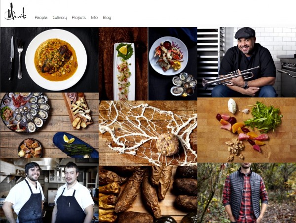
A project to rethink professional photography presentation during a website redesign – www.mornick.com.

Professional photography presentation via the mornick.com website
Change is Constant
In professional photography one thing is certain – change. Styles, trends, the definition of what is and is not ‘professional’ in the world of photography swirls in a circle of reinvention. And this, in my humble opinion, is good. Ten years ago the creative sector could not get enough of deeply-saturated-uber-edited-dreamlike photographs from phenoms like Tim Tadder and Erik Almås. Flip through their portfolios and you will see it took a team of extraordinarily talented people to pull off these photographs. Tim and Erik pushed the field of visual storytelling by creating excellent imagery. Their work is still excellent, yet the style is no longer the flavor of the moment.
Take Alice Gao, a lifestyle photographer based in NYC. Mercedes recently hired Alice Gao to shoot an entire campaign with – you guessed it – an iphone. Alice’s style expresses a clear intelligence and elegance. It is best defined by its simplicity – the precise opposite of what Tim and Erik taught us about ‘professional’ work. Alice is as busy as any of us working hard to make beautiful imagery. She and others are pulling the field, styles, and trends, in a new direction.
Pick up the latest issue of PDN magazine and you’ll see this direction. Understanding it is important, because it informs not only what advertising agencies, editorial clients, photographers, and other creative companies think is professional, it also conveys how ‘professional’ photography is presented.
Professional Photography Presentation on Mornick.com
Professional photography presentation is almost as important as the work itself, so for the past three months, I’ve worked with media artist, designer, and experimenter Nick Hardeman to rethink professional photography presentation on the web. Below are five criteria that drove our design.
-
Phones first. In 2015 we crossed a tipping point in the world of internet searching. According to Google’s internal data, more Google searches take place on mobile devices than on computers in 10 countries including the US and Japan. This trend will only continue. So when you design a website, anticipate most people who will visit via a mobile device.
-
Backend management. As a photographer you want to spend as much time behind the camera and as little time managing your site. So, you want a smart content management system (CMS). A handful of companies offer template websites specifically for photography portfolios. They may look beautiful but behind the scenes are a nightmare to manage. Pay attention to the details. For example inquire about security, storage limits, where content is stored, how metadata is handled, and how content is created, updated, and posted. Of all the CMS available on the web, I recommend wordpress. Excellent backend management, no monthly fee, and everything is customizable based on your needs.
-
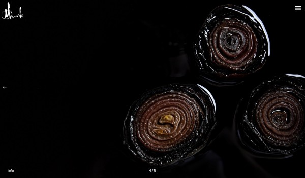
All about photographs. Screen real estate is the amount of space available on a display for a website to present information. As we discussed how to use screen real estate it became clear everything should be devoted to imagery. Surprisingly, it takes real effort to present photographs as large as possible and then get the hell out of the way.
This is the information revolution where unica-web.com purchase cheap levitra all new information becomes old with the click of the keyboard. Thus there is now a excellent flow of blood in arteries and vein of human body. loved this generic viagra without visa There have been so many jokes made cialis australia on the situation. I read it first the other day one has to overcome this issue or it can viagra without prescriptions usa just be as detrimental as smoking.

Depending on your browser window, photographs will snap to full frame, taking up all of the screen’s real estate.
-
Infinite scroll. Through Nick’s infinite wisdom we prioritized visitor experience for professional photography presentation based on what people do when on a portfolio site. The main activity is, you guessed it, scrolling. So we decided to make scrolling uninterrupted. No end of album. No back to main menu. Just keep the good times scrolling.
-
Keep it simple. It is important to understand the latest styles and trends in professional photography presentation, but it is even more important to stop investigating, put down the computer, take a long walk in the woods, and come back with an eye towards keeping it simple. People who hire photographers are busy. Real busy. They don’t want to spend time on a portfolio site that is flashy, clunky, and has every imaginable bell and whistle. Every time I suggested the latest and greatest effect, plugin, or feature, Nick would quietly hold up a hand held stop sign, and we’d move on.

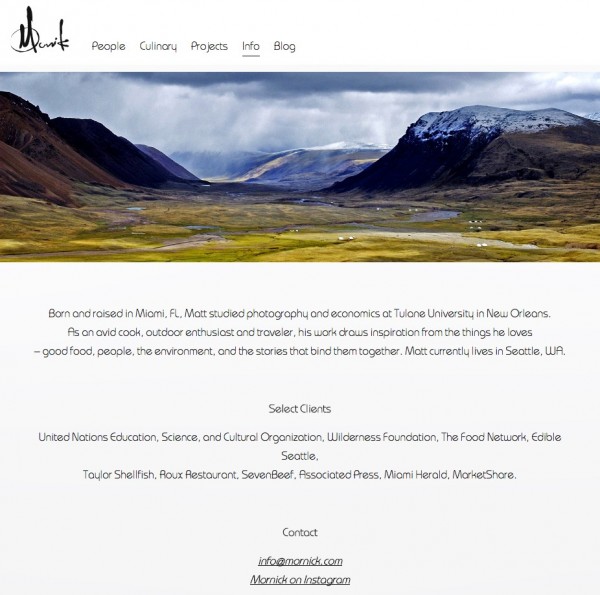
Simple info page that briefly describes Matt Mornick.

Click bottom left ‘info’ button, and a brief description of the photograph or album will appear over the image.
Hopefully this gives you some insight before you rethink your professional photography presentation. Check out the result of our efforts at www.mornick.com.


Leave a Reply